Saturday, March 19, 2016

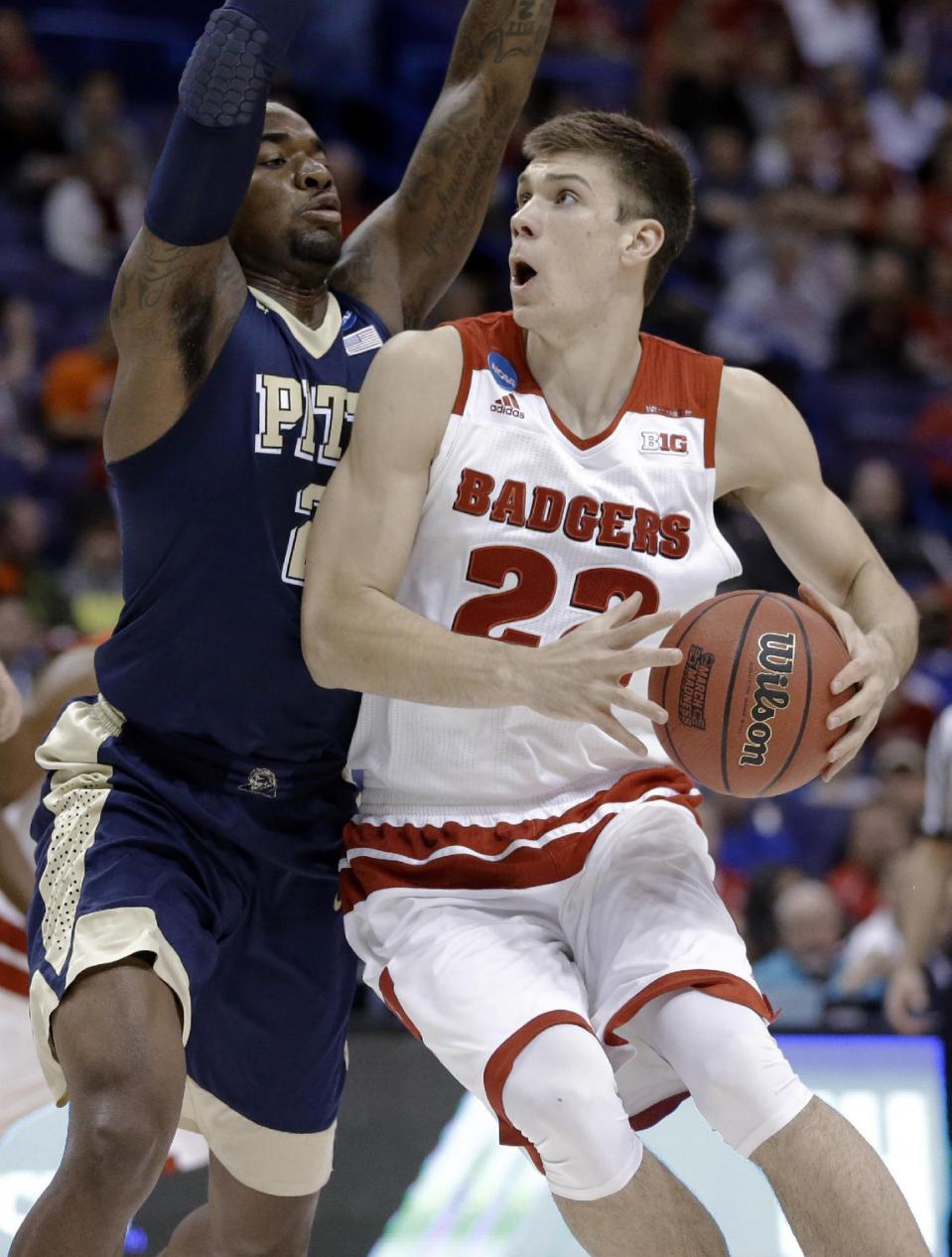
Pitt Loses Ugly Game To Wisconsin 47-43

Clink.  Clank.  Clunk.  If you watched the Pitt/Wisconsin game on Friday night, you heard a lot of that noise as the basketball repeatedly hit the rim for both teams.  The number tenth seed in the east region, Pittsburgh, lost to the number seventh seed, Wisconsin, 47-43.

To say this game was awful is an understatement.  Wisconsin shot overall from the field 17-53 (32.1%), while Pitt shot 18-48 (37.5%).  Pitt started off quick, as James Robinson had six quick points in the first few minutes of the game, but fell silent the rest of the game, only scoring one point after.  Only one person scored in double figures for Pitt, Jamel Artis with 13 points.

To give my own viewpoints of this game is very difficult, due to the point that nobody on either team, or a team itself really stood out to me.  This was by far the worst NCAA Tournament basketball game I have watched in awhile.  You expect a 16th seed to not put much of a showing against a number one seed, but you expect a 10/7 game to be entertaining and exciting.  I was never excited when Pitt was up double digits, because I watch too many games of them blowing a double digit lead.  As I sat there, all I could think about was, "So how will Pitt blow the game this time?"  If Pitt could of nailed shots in the first half, they could of easily disposed Wisconsin.  Last, I was surprised that Ryan Luther only played four minutes for Pitt, while not even being in foul trouble.  To me during the season, he was one of the best players down the stretch for Pitt when they were struggling.

All in all, I am grateful that Pitt's basketball season is over.  I could be wrong, but I am expecting more of the same for next year or even worse.  At least we can now focus on the Penguins march to the playoffs, and the hope of the Pirates making a deep run in October.

https://sports.yahoo.com/news/no-7-seed-wisconsin-trudges-past-pittsburgh-47-010217425--ncaab.html 

Monday, March 14, 2016

OT: Verdana Font

Well, here it is, my final non sports blog.  I again was messing around on Word to see what font was interesting, and what I could talk about.  I came across the font Verdana created by Matthew Carter.  It is a sans-serif font, and to me Verdana is very legible.  It is easy on the eyes all around, and could be used across multiple platforms.  If I hadn't decided to use Georgia as my main font for my blog, I would definitely had considered using Verdana.  Below are some examples of the text Verdana:


http://idsgn.org/images/apple-switches-to-verdana/apple_before_after__full.png


http://likeithateit.net/wp-content/uploads/2009/08/verdana-font.gif


https://99designs.com/blog/wp-content/uploads/2012/04/dominos-pizza_blog.png

Tuesday, March 1, 2016

OT: Chalkduster Font

I was messing around on my word document to figure out a topic for a typographic post.  I came across a cool font which is called Chalkduster.  Now, I wouldn’t use this type of font for a paper to submit to my professor, but I would definitely consider using it for an InDesign project or Photoshop project.  It is very unique and has a flair to it that many fonts don’t have.  Even though it is a san serif font, to me, it isn't very legible, but to use this font for a brief slogan on a billboard would be very effective.

Credit: https://blogger.googleusercontent.com/img/b/R29vZ2xl/AVvXsEjdKoB77stvGX0YVC3ZksHWZ3dbU752bTLzJ54jix62MOZAne-AiKBGhjudNJiSdoLJIGGKa9zHTNQ5l6slYViuFgbrT1-4W1VngqzTBFfmObrsc1azxwg8s8zca3alUOjQsWOn7q86t4E/s1600/chalk+duster.jpg


Credit: https://alexrister1.files.wordpress.com/2014/01/chalkduster.jpg


http://www.typographer.org/Resources/2009-aug-chalkduster.jpg


OT: Photography in a Blog

One thing I thought of while putting together my blog, was the desire to incorporate more of my own photos.  While you are able to incorporate them in certain locations, I would prefer to be able to utilize more of my photography in the Blogger background.  While words are obviously important in a blog, photos are able to create depth and uniqueness to one’s blog.  I enjoy photography immensely, and would like to continue my craft in that area after I graduate.  


Photo Credit: Myself


Photo Credit: Myself


Photo Credit: Myself


Photo Credit: Myself


Monday, February 22, 2016

OT: How Black and Gold Represent Pittsburgh's Major Sport Teams

As you can tell from those who have visited my blog, and for people who have known me most of my life, Pittsburgh sports teams play a major impact.  When achieving the outcome of my blog, I wanted to be able to utilize the color scheme of the teams Pittsburgh represents.

How does black and gold achieve inspiration of that goal?

Wherever you go, whether it be in the United States or around the world, most people understand that black and gold are synonymous with Pittsburgh Sports.  I remember one time wearing a Steelers jersey in the Outer Banks, and an employee from our hotel restaurant shouting, "Are you from Pittsburgh?!" By all three major sport teams in Pittsburgh using the same color scheme, it allows the people of Pittsburgh to galvanize with our city and cheer on our teams.
http://media-cache-ak0.pinimg.com/736x/3d/2a/79/3d2a794c34ebd2ca632e95acaa9f88a1.jpg
https://images.search.yahoo.com/search/images;_ylt=AwrBT4GmV8tW9UAAeI1XNyoA;_ylu=X3oDMTE0bG82MGM5BGNvbG8DYmYxBHBvcwMxBHZ0aWQDQTAyMDBfMQRzZWMDcGl2cw--?p=Pittsburgh+skyline+in+black+and+gold&fr=yfp-t-201&fr2=piv-web#id=16&iurl=http%3A%2F%2Fi.ebayimg.com%2F00%2Fs%2FMTA5NFgxNTk1%2Fz%2F42QAAOSwyQtVquLH%2F%24_35.JPG&action=click
http://www.sports-logos-screensavers.com/user/Pittsburgh_Pirates10.jpg

OT: Georgia Font

I am bombarded with texts in my day-to-day life being a communications major.  So when I was assigned the blog project, I wanted to find a font that wasn't boring or typically used.  I went through the advanced settings of blogger and found the font of Georgia.  I feel that the Georgia font allows for easy readability, and a more unique style compared to something we see everyday like Times New Roman.  Furthermore, I feel that not only does my blog stand out with a non-generic font, but I believe that other designers using this font by creating billboards, magazine ads, the font for a novel, etc., will allow them to stand out from their other competitors.


Credit:McDonalds

http://fontsinuse.com/uses/10160/baker-website

Friday, February 19, 2016

Penguins Storm Past Red Wings 6-3


I personally have never been in a hurricane, let alone a tropical storm, but you see on TV the devastating rain, the tremendous wind, and sometimes debris in the air.  After last night’s hockey game where it was furious action up and down, a total of 77 shots on goal by both teams, and a total of 9 goals by both teams, needless to say it was a whirlwind of a game.

The Penguins were victorious over the Detroit Red Wings 6-3, with the stand out player last night being Phil Kessel who scored twice.  Again, I won't bore you with a game summary, so I will let you know my takes on the game.

Again, I was very impressed by the Penguins being able to transition out of the defensive zone and into the attacking zone.  While under other head coaches, they would dump and chase the puck, it would seem constantly.  Now under Mike Sullivan, the Pens are able to utilize their speed in the neutral zone and carry the puck into the attacking zone instead of just dumping it in and going after it.

It was nice to see Phil Kessel get on the board twice.  We have to give Mike Sullivan a lot of credit mixing up the lines, allowing Sidney Crosby to be the playmaker that he is, and Kessel the finisher.  Furthermore, it was nice to see Scott Wilson get his first career NHL goal.  The line of Wilson-Porter-Sheary have been doing a tremendous job generating scoring chances, and it was nice to see it finally pay off with a goal.

Last, I think that Fleury's performance last night went somewhat unnoticed.  I feel like he had a spectacular game, stopping 35 out of 38 shots put on net.  The save he made in the second period with him inside his own net and stopping the Red Wings from scoring with the paddle of his stick was astounding.  I know the goal would have been disallowed if it did go in because of goaltender interference.  None the less, Fleury shut the door on that opportunity.  I didn't feel like our defense played that well and let Fleury out to dry on numerous occasions.  Detroit would of definitely scored more goals had it not been for Fleury's play last night.


All in all, I'm glad the Pens took two points out of this feverishly paced game against Detroit.  Hopefully they enjoyed the eye of the hurricane today, because a storm of the Tampa Bay Lightning is ready to strike tomorrow at Consol Energy Center!

http://www.post-gazette.com/image/2016/02/19/720x_q90_cMC_a3-2_z/20160218mfpenssports09-2.jpg